I’ve been often asked about the meaning behind the logo.
The colours in the logo have meaning. Blue represents Alberta, water, and the Rocky Mountains. Green is of course, Saskatchewan and new growth of crops and plant life. Yellow is the wheat of Manitoba, healthy soil, as well as the tan of animals. These our symbols of our lives on the prairies. All the elements working together lighting the fire within us to create a better tomorrow.
The circles indicate a circular economy, a circularity of our lives. Multiple circles working together for that better tomorrow. Different opinions and strategies working together. Our diversity is key to a healthy community as diversity is key to a healthy environment.
I love the prairies
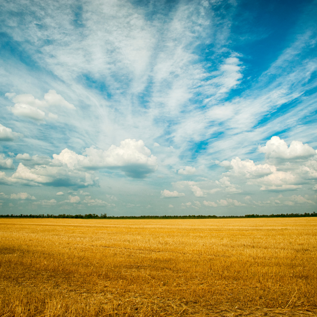
Growing up and living on the prairies, there is nothing so beautiful as a prairie sunset or sunrise. The gentle rolling hills or perfectly flat fields give a huge sense of space. The sunny clear skies in the summer and winter make me feel happy despite the heat or cold. The corduroy gravel roads between a patchwork quilt of fields leaves a grid of community and togetherness.
The prairies are home. Many folks complain about how there is nothing to see driving across the flat prairies. There is lots to see. Lots of crops getting ready for harvest. Lots of birds in the skies and clouds to see. There is an eagle flying by that cloud that looks like a bunny. Or a squished heart. Do you see it?
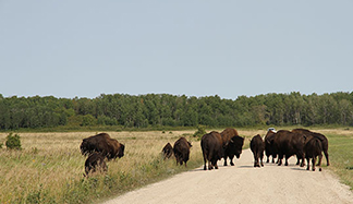
We cannot forget about the majesty of the Bison at Lake Audy in Riding Mountain National Park or Elk Island National Park.
There are many amazing things to see and do on the prairies. So many interesting museums, sports, and fun activities. Check out this website to learn more. So many amazing adventures to be had in our backyard.
Here at Prairie Circular Economy, we can help you become a leader in your community. Contact us for a free discovery call and we can work together.